
Apr 14, 2025
This case study focuses on enhancing LinkedIn’s connection experience on both mobile and desktop by introducing a required message step when sending invites. The goal was to encourage more meaningful networking through custom messages, while also integrating optional AI-generated suggestions. Free users get a limited number of AI generations, while Premium users get unlimited access.
Research
I used a combination of Typeform surveys and Maze usability tests to get both qualitative and quantitative insights.
Survey (via Typeform)
Gathered input from users on how they currently send/receive connection requests and their thoughts on AI-generated messaging.
Usability Testing (via Maze)
Tested different flow variations to see how users interacted with mandatory message steps and AI suggestions in real time.
I also looked at competitor platforms like Bumble Bizz and outreach tools for inspiration on encouraging personal engagement.
Design Process
User Research
We began with Typeform surveys and user interviews to understand user behavior and gather insights on their messaging habits.
Synthesis
Collected insights were grouped into themes such as friction, awkwardness, and visibility. We identified key user needs: encouragement, inspiration, and clarity.
Sketching & Ideation
We explored multiple user flows, focusing on minimizing friction and maximizing customizability to suit different user preferences.
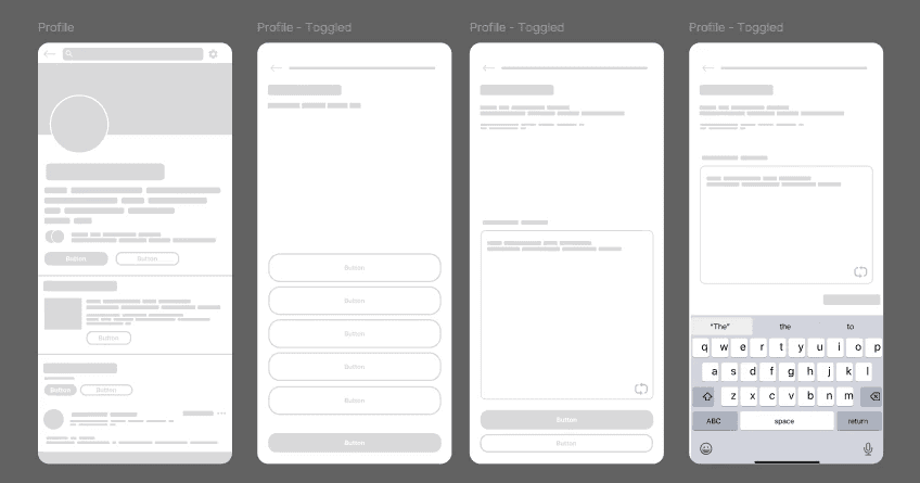
Wireframes
Low-fidelity wireframes were created to visualize the refined connection journey. These wireframes were designed for both mobile and desktop platforms.
Testing
We used Maze to validate the proposed flows and the placement of message prompts. The design was iterated based on user testing results.
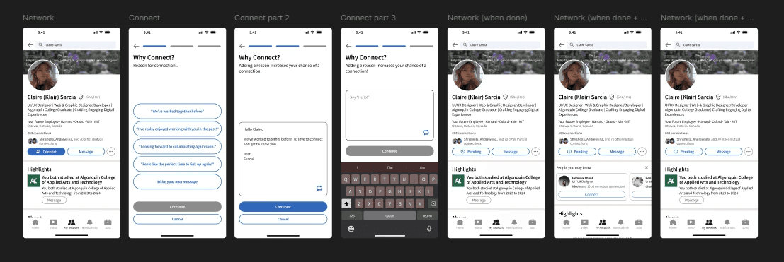
High-Fidelity Design
The final UI introduced a custom message field and a “Use AI” button. We also designed a limited access flow for non-premium users to align with LinkedIn’s model.
Final Flow
The final design included a clear messaging step with optional AI support. It aligned with user expectations while supporting LinkedIn’s premium offering.
Findings
72% of survey respondents said they usually skip the message step unless prompted.
Users were more likely to add a message when prompted right after hitting “Connect”
Maze testing revealed users were more likely to complete the connection flow when the message box was front and center and AI suggestions were optional but visible.
Many free users were okay with limited AI access, but the upsell to Premium felt more attractive when framed around productivity and efficiency, not just "more messages."
Users appreciated AI suggestions but wanted more control over tone and content.
Wireframes
Lo-Fi
Hi-Fi
Outcomes
The final design encourages more meaningful connections while giving users flexible tools that respect their tone and goals.
Testers said it felt “more personal,” “useful,” and “actually made them think before connecting.”
Personalization increases trust—especially on professional platforms.
AI should support authenticity, not replace it.
Premium features feel better when tied to actual productivity, not just status.
If I had more time, I’d love to explore how this message feature could tie into follow-ups post-connection or smart reminders for unanswered invites.
Table of Contents