
Fiona Selection
Online Retail Store
This project involved collaborating with Fiona Selection, a retail fashion brand, to redesign their digital shopping experience.
Fiona Selection
Company
4 Months
Duration
Ottawa, ON
Location
Overview
Timeless fashion, made effortless.
B2C
ECommerce
UI and Web Design
Old, But Gold
Fiona Selection sells clothing designed to last—pieces chosen for comfort, elegance, and longevity. But while the fashion told a timeless story, the digital storefront didn’t. Browsing felt heavier than it needed to be, especially on mobile, and the brand’s quiet sophistication was getting lost in the experience.
This project set out to realign Fiona Selection’s digital presence with what the brand already did well: thoughtful curation, confidence without excess, and comfort that doesn’t sacrifice style.
From Insight to Elegance


Designing Before Decorating
Before exploring visual direction or layout changes, the focus was on understanding the business, the audience, and the broader fashion landscape Fiona Selection operates within. Research combined market analysis, user personas, and documented user stories to uncover where the existing experience was misaligned with shopper expectations.
Across research materials, one theme consistently emerged: Fiona Selection’s values—quality, comfort, and longevity—were strong, but the digital experience didn’t fully communicate them. The opportunity wasn’t to chase trends, but to design with intention and clarity.
Competitive Landscape — What the Market Was Doing Right
Competitor analysis showed that established fashion brands excelled at visual polish, brand storytelling, and high-quality imagery. These elements reinforced trust and helped set expectations around quality and style—confirming the importance of a refined first impression.
Competitive Gaps — Where the Experience Fell Apart
Despite strong aesthetics, many competitor experiences introduced friction:
Dense layouts and information overload
Excessive scrolling when browsing collections
Unclear sizing and product context, especially on mobile
For Fiona Selection’s audience, these issues led to hesitation rather than confidence—highlighting a gap for a more curated, readable, and user-friendly shopping experience.
Solving Structure Before Style
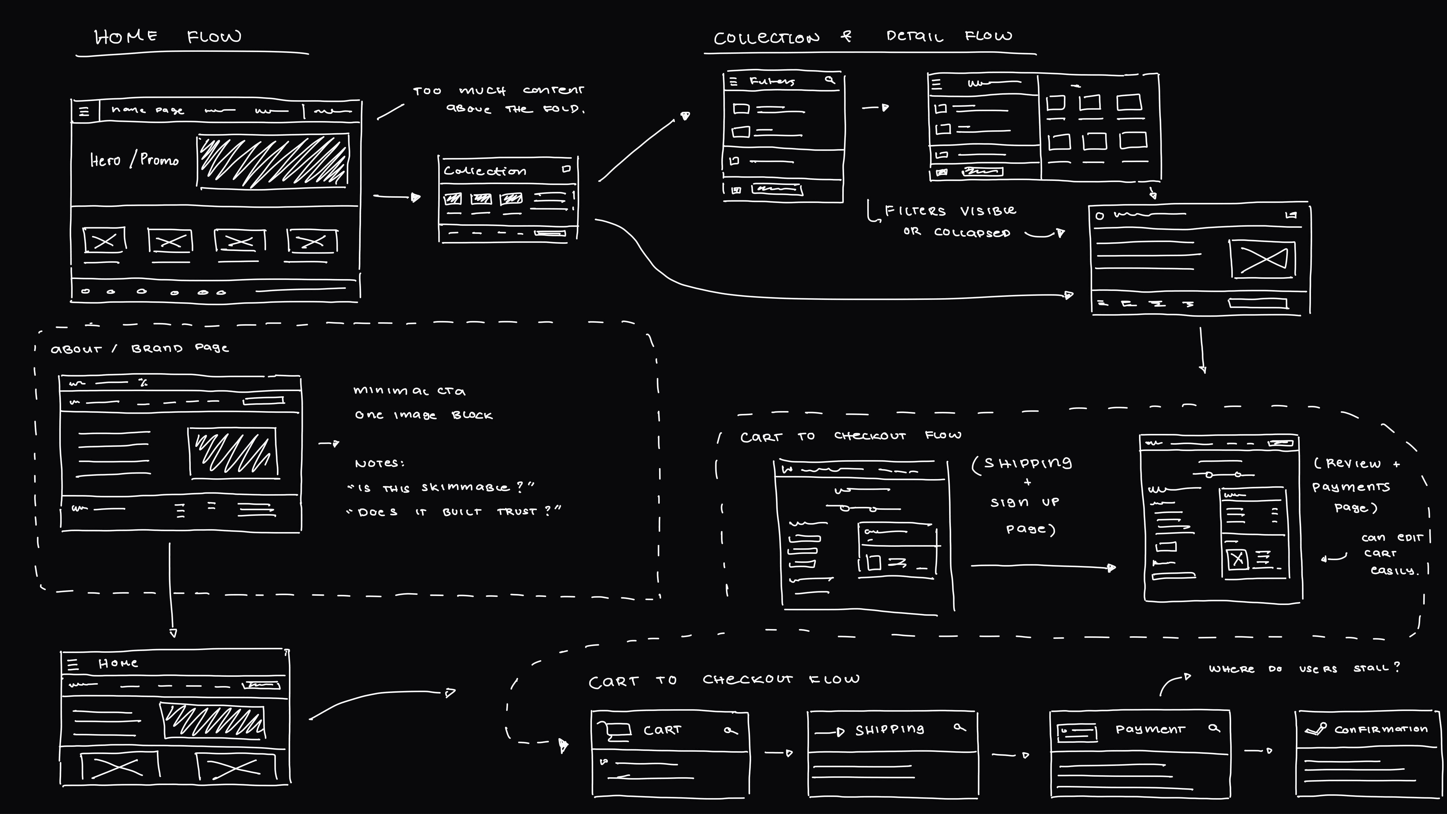
Lo-Fi Wireframes — Mapping the System
Early wireframes focused on validating layout and flow before introducing visuals.
Tested hierarchy, navigation, and scroll behavior
Explored how users browse collections and move between pages
Identified friction points early, without visual distraction
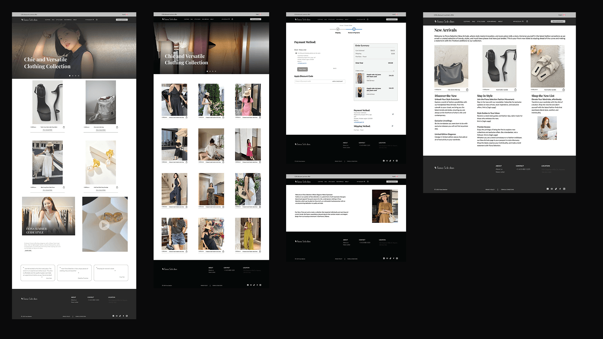
Hi-Fi Exploration — Designing for Density
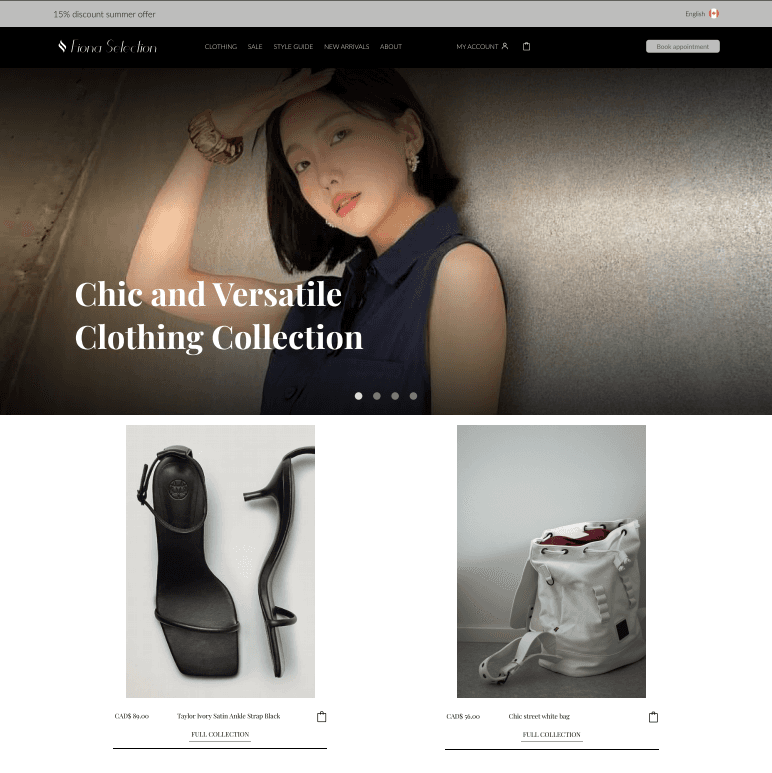
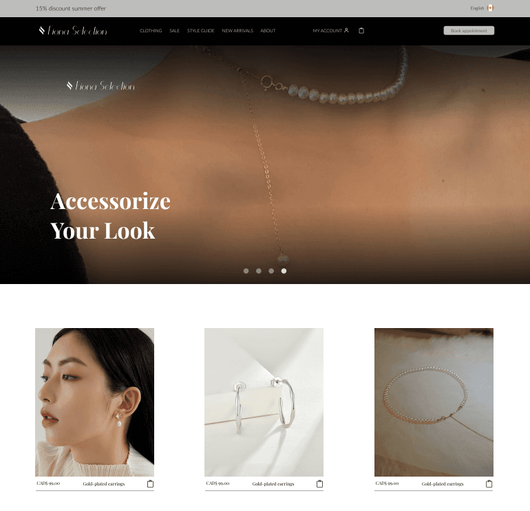
With structure validated, high-fidelity designs refined the experience visually and interactively.
Introduced typography, spacing, and visual hierarchy
Improved scanability across mobile and desktop
Translated structure into a polished, usable interface
Design Decisions, Measurable Change
Rather than chasing surface-level trends, the redesign focused on reducing friction and supporting confident decision-making—especially for mobile shoppers.
Key Outcomes
↓ Scroll fatigue by restructuring long product collections
↑ Product discoverability through clearer hierarchy and curated layouts
↑ Readability & accessibility with improved typography scale and spacing
↑ Brand trust signals through consistent visuals and clearer product context
Mobile-first experience optimized for extended browsing sessions
Design at Scale
These improvements were supported by a thoughtful design system and structured workflows:
20+ screens designed across mobile and desktop
3 primary friction points identified and addressed (navigation, scroll depth, sizing clarity)
4 user personas informing layout, spacing, and content decisions
End-to-end redesign spanning homepage, collections, and product browsing
5+ competitors analyzed to identify market gaps
Insight
Browsing felt tiring
Dense layouts
Sizing hesitation
Weak brand signal
Design Change
Curated collection layouts
Increased spacing & hierarchy
Clear size & fit emphasis
Cohesive visual system
Impact
Faster, calmer navigation
Improved scanability
More confident decisions
Elevated brand perception
Final Outcome & Reflection
A Storefront That Matches the Brand
The redesign transformed Fiona Selection’s website into an experience that finally reflects what the brand has always stood for: timelessness, comfort, and quiet confidence.
Grounded in research and real shopping behavior, the new experience supports a smoother journey from discovery to decision—especially on mobile. The storefront now feels considered rather than crowded, refined without being rigid.
What Could Be Improved
With more time and real-world analytics, future iterations could explore:
Behavioral data to validate browsing patterns
Enhanced filtering and personalization
A/B testing layout variations to further optimize flow
Designed to age as gracefully as the clothing itself.
All right reserved © 2025